Explain different methods of effective presentation of data. List different types of graphs and write note on each type.
If you want to view other related topics. Click Here.
Presentation of data is tricky. Not everyone in your audience likes to crunch numbers. Learn 5 ways to make your audience understand your message in 2 seconds or less.
Numbers are distracting
Here are the 5 tips to present your key message in 2 seconds.
Let’s do a quick makeover of a 3D chart to convey the key message under 2 seconds:
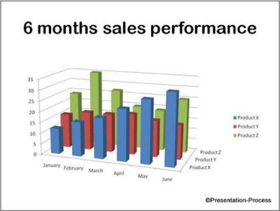
The slide looks very colorful but complex. The chart says which product performed how well in each month over the past 6 months. Phew! That’s a lot to grasp at one time. Avoid any Presentation tips that requires you to use make information complex.
Consider this alternative presentation of the same data:

We used a simple 2D line graph to show the trend over time. The title gives a clear idea of what to look for in the slide. In 2 seconds your audience ‘gets’ the message of the slide.
To learn 29 creative ways to present data and other components of your presentations creatively, check the free Creative Presentation Ideas e-course
Take a look at this slide with a pie chart:
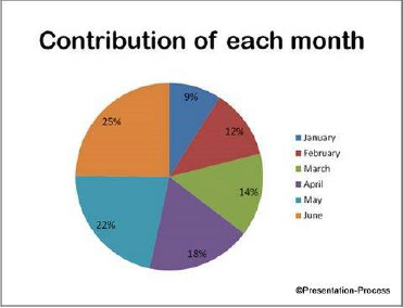
Consider this alternative pie chart:
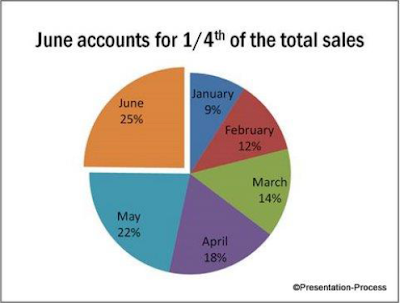
Audience can find all the relevant information in one place instead of having to search around the slide. The slide title gives the core message. The relevant part of the pie chart is isolated for easy reference. So, your audience ‘gets’ your message under 2 seconds.
Take a look at this slide with data:
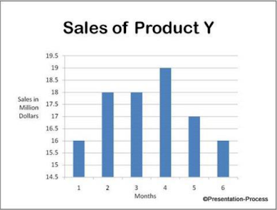
 Consider this alternative slide with graph:
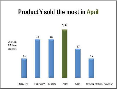
The key point almost jumps out of the slide. To make presentation of data effective, we ruthlessly removed everything that can potentially distract the audience attention. There are no grid lines. Units on the y axis are replaced by data labels. The key number is made larger than the rest. Naturally, your audience gets the message under 2 seconds.
There are different types of graphs in mathematics and statistics which are used to represent data in a pictorial form. Among the various types of charts or graphs, the most common and the most widely used ones are given and explained below.
- Statistical Graphs (bar graph, pie graph, line graph, etc.)
- Exponential Graphs
- Logarithmic Graphs
- Trigonometric Graphs
- Frequency Distribution Graph
Statistical Graphs
A statistical graph or chart is defined as the pictorial representation of statistical data in graphical form. The statistical graphs are used to represent a set of data to make it easier to understand and interpret statistical data.
Exponential Graphs
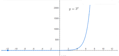
Exponential graphs are the representation of exponential functions using the table of values and plotting the points on a graph paper. It should be noted that the exponential functions are the inverse of logarithmic functions. In the case of exponential charts, the graph can be an increasing or decreasing one based on the function. An example is given below which will help to understand the concept of graphing exponential functionin an easy way.
For example, the graph of y = 3x is an increasing one while the graph of y = 3-x is a decreasing one.
Logarithmic Graphs
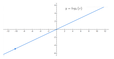
Logarithmic functions are inverse of exponential functions and the method of plotting them are similar. To plot logarithmic graphs, it is required to make a table of values and then plot the points accordingly on a graph paper. The graph of any log function will be the inverse of an exponential function. An example is given below for better understanding.
For example, the inverse graph of y = 3x will be y = log3 {x) which will be as follows:
Trigonometric Graphs
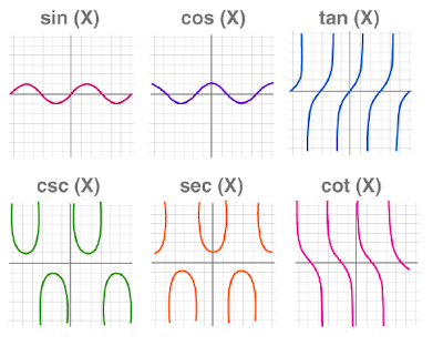
Trigonometry graphs are plotted for the 6 trigonometric functions which include sine function, cosine function, tangent function, cotangent function, cosec function, and sec function. Visit trigonometry graphs to learn the graphs of each of the function in detail along with their maximum and minimum values and solved examples.
Frequency Distribution Graph
A frequency distribution graph is used to show the frequency of the outcomes in a particular sample. For frequency distribution graphs, the table of values is made by placing the outcomes in one column and the number of times they appear (i.e. frequency) in the other column. This table is known as the frequency distribution table. There are two commonly used frequency graphs which include:
- Frequency Polygon
- Cumulative Frequency Distribution Graphs
